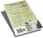
Not for a minute do I believe our process for selecting covers is unique. Here at Canon, it’s a collaboration of ideas. We have two talented graphic artists on staff, David Dalbey and Rachel Hoffmann. They each come to Canon with a suitcase filled with different skills and abilities. Laura Blakey won’t admit it, but the woman has mad graphic design skills. Most importantly, the concepts they each form in their brains are completely different. Add to that the unbelievable talent of Mark LaMoreaux with his camera…and the sky is the limit.
Whether an old book is getting a new cover, or a new book is getting its first cover, the process is the same. The first thing we determine is what the author is trying to communicate. If the book is titled Flying Pigs, but the content is about “things that ain’t gonna happen,” we make every effort to avoid putting a graphic of a flying pig on the cover. That’s too easy.
Sometimes the artist has a concept in their head and submits it to the team for an initial review. Then there are times when the artist can’t “see” anything and needs our input. Regardless of who comes up the concept, there is always feedback…lots of it. Even brutal feedback. Some covers get to the point of completion and we’ll realize it just doesn’t work…it won’t stick. It gets tossed out and we start all over. 
Our first “double” cover for Building Her House, by Nancy Wilson, was a result of my love for options. We had so many fantastic pictures to choose from, so I said, “how about two?” The cover design is Laura Blakey’s. The white cabinets don’t really exist as they appear, but David worked his Photoshop magic and moved the top cupboards to the bottom. Viola. Both covers are well-received and neither is favored above the other.
 In the case of How to be Free from Bitterness, I suggested a few things that David pretended to like. (C’mon, Dalbey, you know you didn’t like my ideas.) He said, “I’d like to show you a cover I came up with. Tell me what you think.” I waited for the email, opened up the jpeg, gasped, then laughed out loud. I kept saying, “that’s fantastic but there’s no way we can use it. People would freak out.” I printed out the cover and showed it around the office. The response was the same each time. A gasp followed by laughter. But in the end, the cover perfectly conveyed the title in a way we hadn’t expected. And the customer response is fantastic.
When Rachel started working on The Book Tree written by Elizabeth McCallum and Jane Scott, we were all over the place with ideas. I remember sitting at the drive-up window at my credit union when I saw, in the window, a small poster of a tree with words hanging off the branches. I asked for a brochure and delivered it to Rachel. Every little bit helps. The first concept Rachel came to us with had “storybook” feel to it. Fairies and flourish. It was just lovely. I’m not sure how she 

Another cover that went through several revisions was 
To be honest, there are times when our tastes differ and we disagree, and as a result, the ideas that flow from the disagreement are priceless. In the end, with a smaller font here and a darker shadow there, we find a perfect compromise and relish the birth of a new cover.
We have plans to reprint The Wilson Family Series (text revisions & *new* covers) and many of our old covers are in line for a facelift. I love change! Change is good! Keep checking back to see what’s new and improved at Canon Press.

Interesting to know! And see examples. I wasn’t aware of the dual covers for Building Her House, read the yellow one. And I do love the cover for How to be Free from Bitterness.
Wait, no fair. You can’t change all the family series covers! How am I supposed to find enough money to buy all the new ones too? I’ll feel so left out if I’m all old school.
But thanks for the behind the scenes look – I love Canon covers.
Sadly, I was NOT aware of the dual covers for “Building Her House”–I thought I could buy TWO volumes of Nancy’s Credenda columns.
When will you publish an additional volume??
(By the way, I’ve heartily enjoyed “Building Her House”.)
Hello Beth,
An additional volume? That’s a good question. I’ve got Laura looking in to it with Mrs Wilson.
Thanks,
Lucy Zoe
Thanks for your consideration!